

"Our CEO's demands a visually striking webpage that exudes both organization and modernity."
Over a span of three weeks, I undertook the challenge of crafting a digital environment tailored for a fictional brand operating as an internet service provider.
Throughout the journey, in each class session, I engaged in conceptual exploration and participated in design critique processes, receiving valuable feedback from both my instructor and fellow designers. This collaborative effort allowed me to refine various concepts and ultimately elevate the final outcome.
Goal
Develop the digital platforms of a fictional internet service provider brand
Role
UI Design, Benchmark, Ideation and Prototype.
Timeline
Mar, 2024 - 2 weeks
Resources
Paper, Figjam and Figma.
Concept
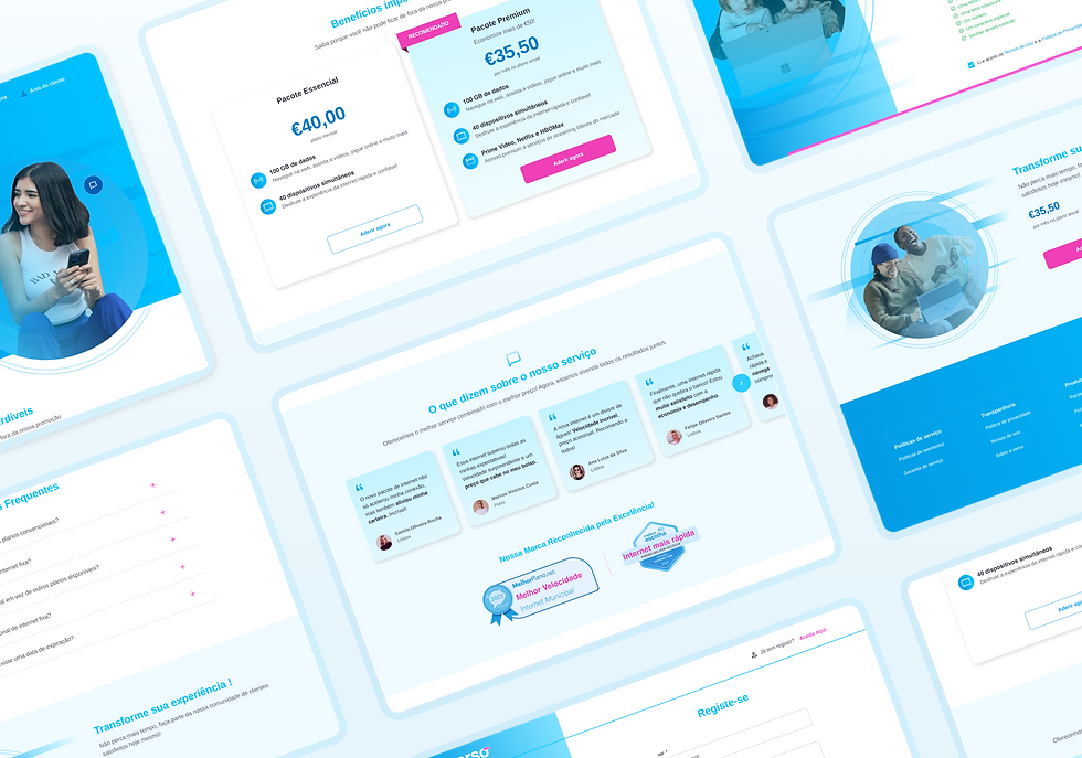
Verso is a dynamic internet provider, acclaimed for its award-winning service quality, excellent speed, and affordable pricing. Accordingly, the project was crafted to embody these values throughout its landing page, employing thoughtful selection of visual elements, formats, and overall site layout.

Prototype

Desktop version
In the desktop version of the project, beyond the landing page, I also designed and implemented user-friendly login and registration flows. For the login process, we prioritized simplicity and efficiency with clear input fields and intuitive navigation. Similarly, in the registration flow, we aimed for a seamless experience with user-friendly form fields and support text when necessary.

Mobile version
In addition to the desktop version, I also ensured the product's responsiveness on mobile devices. By prioritizing mobile responsiveness, I aimed to ensure that the landing page effectively engaged and converted users regardless of the device they were using.

Learnings
It was weeks filled with invaluable learning experiences alongside the professor and classmates. One particular highlight was actively participating in and presenting our work during the design critique sessions. These sessions provided a platform for us to seek feedback, suggest improvements, and brainstorm new solutions collaboratively. Engaging in these critiques not only honed our presentation skills but also fostered a culture of constructive criticism and continuous improvement within the team. It was a rewarding opportunity to refine our designs, gain fresh perspectives, and ultimately elevate the quality of our work through collective effort and shared insights.
Colors and typography

When considering the brand's colors, we initially based ourselves on the palette present in the logo. Regarding the complementary colors, we essentially adapted the palette to ensure not only an inclusive and high-quality experience for all users, but also optimal levels of accessibility across all interface elements.

As for the choice of typography, we adopted the Arimo font from Google Fonts. This decision was motivated by its visual similarity to the original logo, which contributes to a cohesive brand identity across different touchpoints. Additionally, Arimo offers excellent legibility on various devices and screen sizes, promoting a comfortable and effective reading experience for users.